Planning ahead – towards assessment

Perhaps I’m being over optimistic but it is currently my intention to submit my work for March assessment which means getting it to the OCA by the end of January.  Optimistic because I have just started on part 5 and will have no opportunity to go out and take the photographs until the end of September or early October.  Furthermore, with the exception of Assignment 4, which I have just revised, each of my previous assignments need some revision. So how can I proceed to meet that deadline without becoming stressed out?

We are about to decamp to Scotland for 3 weeks, part holiday part family duty and it is my intention to take as much with me to work on as I can.  There is apparently wifi in the cottage where we are staying, though that is yet to be tested, so intend to do as much research for part 5 as I can in advance and download whatever I find to my iPad so that it can be read whilst I am away. I will also take sets of images that need to be edited down to shortlists and possibly sequenced in a different way from the drafts originally sent to my tutor, the Lightroom Classic app for the iPad is pretty good for that.

For Assignment 1, I will remake the double sided concertina book I made for the Osmosis exhibition at the end of last year.  I am fairly happy with the photographs selected but want to revisit the making of the book by printing directly onto the paper used for the book rather than attaching the photographs after the book is made.  I am currently researching the best photo paper to use for this and specifically what is available in a square format. This will need to wait until I get back.

Assignment 2 draft was to my mind, a disaster though my tutor thought it was retrievable. I have re-shot the journey but have not really gone through and done as serious edit – I can take this with me.  I have also not decided on the format of submission for this; possibly slide show, I can play around with that.

I was over ambitious with my ideas for Assignment 3 book submission, a mix of new and found photographs and text printed on photo paper and vellum. That is all still in there but I have simplified it in my mind as I know that to present a badly thought out book will be far worse than just submitting prints. It is still my intention to make a Japanese stab bound book. I will use double sided photo paper which I am currently exploring. I will still use the found photographs but possibly on separate pages from my own rather than blending them together.  Whilst most of this will need to wait until I get back, I still want to use quotes from a book called ‘Forest Voices’ (Phelps, H. 1996), for which I have permission from the publisher, so my holiday job is to take this little book with me and select the most appropriate quotes.

I have just had the latest film containing my Assignment 6 possibilities developed and am hoping to have time to edit those before we head north.  It is still my intention to make a tunnel book for assessment and have just bought a new trimmer to cut the apertures in the photographs, this is another possible holiday activity if I get the edit done before we go.

After we get back, I need to crack on with Part 5 and Assignment 5 and hope to be able to do my walks by mid October.

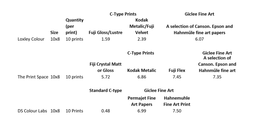
I also need to source more photo paper samples having so far only got a Fotospeed Inkjet test pack, which to be honest is a mixed bag.  My preference is usually PF Lustre or Pearl and I have previously used a Fotospeed Platinum Lustre which I really liked but it seems no longer to be available.  Included in the test pack are 2 gloss papers which I wouldn’t normally use, and two metallic which have a strange surface. I will download the print profiles and try them out but can’t imagine that they will be suitable for my assessment work. I have no experience of using Matt paper but this seems to be the available option when it comes to double sided so again, experiments are needed.

I have enquired about a book making workshop at The Photo Parlour and Nottingham and been advised that the next one is likely to be at the end of October which will fit perfectly.  This workshop comes highly recommended by OCA student Hazel and covers sequencing as well as the practical aspects of making books.

The other thing I need to do concerning the books is research the best fonts to use. Another holiday activity?  Maybe but I also want to chill out and enjoy some Perthshire photo opportunities.

Resources:

Phelps, H. (1996) Forest Voices. Stroud, Gloucestershire: Tempus Publishing Ltd.
Inkjet Paper’s | Fine Art paper, Photo papers and Canvas | Fotospeed – Fotospeed (s.d.) At: https://www.fotospeed.com/Fotospeed-Inkjet-Papers/catalogue/1123/ (Accessed on 31 August 2019)
Home – The Photo Parlour | Traditional Photographic Darkroom and Studio | Derby (s.d.) At: http://www.photo-parlour.com/home (Accessed on 31 August 2019)

Response to Assignment 4 Feedback and Final Version

Assignment 4 reflection on tutor feedback

Assignment 4 reflection

Having mulled over my tutor’s feedback and comments made on my assignment 4 draft, here is my response and revised version. The first point was that he thought my choice of artists was appropriate and I had handled it with confidence, so that’s good, I was on the right track.

In terms of improvement:

  • The main comments on the draft itself were suggested simplifications of the language, mainly getting rid of unnecessary words and casual remarks to give a more professional tone.
  • The critical aspect of the essay could be improved with the inclusion of comment from additional reviewers.
  • Then there was a section on how typography can be used by artists in different ways using different medium. I’m not entirely sure if this related to this assignment or others where I have indicated that I would make handmade books for assessment, or maybe the next where I also want to include a text element.
  • There was also a suggestion that I could have included more or my own work in the essay.

The first point was straightforward, ish! I know this is something I have to work on, particularly when/if I progress to level 3.

Taking the last point next, I don’t see how I could do that within the word-count bearing in mind I have tried to use 3rd person as advised throughout, and resist from making personal observations. Unless I could somehow thread it into the discussion of Hamish Fulton’s work. I understand it is appropriate to include an image on the front cover though so have included one of my own there.

My issue with the 2nd and 3rd points is twofold. Firstly word count, as I was within a whisker of the 10% upper margin when headings, quotations and references were excluded, whatever I add to address theses points needs to be removed from elsewhere. The second point was that my choice of artists was deemed appropriate, not too many, not too few so I couldn’t see how I could include further artists using different medium such as film without a major rewrite. In any case, the medium used by Tacita Dean, Jenny Holzer, Martin Creed and Douglas Gordon are all different from Karen Knorr and Hamish Fulton, the only two whose main medium is photography.

I totally agree with the need to beef up the critical tone of the essay, this was my main concern from the beginning. In the main I have found available reviews to be fairly samey, usually prior to or on the opening of an exhibition or sometimes, in the case of Tate, for example, a little background on the artist and explanation of the artwork on show. However, again mindful of word count, I have included further comment from additional reviewers on the work of Jenny Holzer and Douglas Gordon. In the case of Gordon, I found a slightly quirky review by Nick Barley, editor of The List at the time. This one will stick in my mind because of its tone and phases like ‘Why should you believe what I have to say about Gordon? I’m the wrong person to give a balanced view because I know the man’. (Barley, 2006)

To compensate for the additional words, I have removed the first part of the section on Tacita Dean, starting with her work on ‘The Roaring Forties’ rather than ‘When I first Raised the Tempest’, which adds little extra to my essay. I have also removed the discussion on Martin Creed because his work has similarities to that of Jenny Holzer and some of Douglas Gordon’s.

I am still within that tiny whisker of the upper word count margin (3 words I think)  but am happier that this is a more robust and professional critical review. I will continue to look for reviews or comments on the artists discussed but unless I find something that challenges what I have already included or conforms it in a different way and subject to checking online references prior to assessment, this is now the final version.

Assignment 4 final version.docx

References:

Barley, N. (2006) Douglas Gordon. At: https://www.list.co.uk/article/333-douglas-gordon/ (Accessed on 31 August 2019)

Assignment 4: Reflection on Tutor Feedback

As always my tutor’s feedback on my latest assignment was prompt despite him emailing to say that he was going to be away for a week – and I was very pleasantly surprised.  I had feared having re-read both my essay and the brief, that my critical review was more narrative than critical and expected to have to make fairly major changes.  There are of course some alterations suggested but it is not as bad as I had feared.

Positive points:

  • My essay tackled the subject with confidence
  • My choice of artists was relevant to the topic and connected to some of my previous work
  • The tone is well set, with relevant illustrations
  • There are elements of developing a critical framework by the inclusion of remarks and comments of others
  • There are some good elements in terms of noting how typographic elements can be important.
  • Reflective commentary is evident
  • Learning log is becoming well rounded and fully developed
  • Good research
  • Referencing is good

Suggestions for improvement:

  • Critical framework could be expanded further by more comparative analysis by other reviewers or critics
  • It is also worth considering the relationships between how an ‘artist’ might use text and how those others where their work is interdisciplinary might also be relevant
  • Inclusion of some of my own work in the text would help further and he gave following the example from my first assignmentfinal colour-4353
  • Beware of using too many casual remarks – and gave the example‘that frankly leaves you scratching your head’.
  • Think about putting more recordings/visuals in my learning log
  • Think about using smart phone to record impressions from exhibitions

And regarding Assignment 5, many of the artists I have already researched are relevant to my proposed topic which involves walking and at the same time incorporating text.

I’m not entirely sure what it meant by this:  ‘The format you might choose is worth thinking about, at this stage then its good your are making connections between formal technical apparatus and the final work. Best set yourself an achievable aim rather than presenting to yourself the lack of any particular kinds of equipment. If you choose film or digital then you can still make the work which is relevant and resonates with your planned area of interest’  In my initial mind map, here, for assignment 5, I was thinking about which equipment to use, bearing in mind I was going to be walking and as yet have very little experience using my newly acquired TLR. I concluded that my ‘mirrorless’ camera was probably the best option because at this point I am not entirely sure what my focus will be. Having initially read my tutor’s comments, I thought he was suggesting that I was taking the easy way out and in fact had come to that conclusion myself. Now I’m not so sure though, maybe he is saying I would be wise not to take too many risks.  On reflection, I have decided to take the Rollicord for specific subjects, such as the ‘hulks’ in the ships graveyard at Purton, or the bridges along the canal. That way I may have some mini projects within my main project whilst still having a digital backup.

Useful reading/viewing which is related to the exercise on ‘print on demand mock-ups’ but also a comment I made about which font I might use in a book I plan to make for assessment.

My tutor also attached my essay back with some highlighted comments for consideration, mainly to do with my waffelly language, which was really useful.  So, still some work to be done, but not a disaster by any means.


Assignment 5 Preparation 2

First stage of research show sources coloured in mauve and outcomes in yellow.

I shouldn’t have been surprised at finding little concerning the canal in the National Waterways Museum because although this was the obvious place to find information, I found very little there a couple of years ago whilst working on a documentary assignment on Gloucester Docks.  Although there is not a great deal in Hugh Conway Jones’s book that I can use because I don’t want to repeat what he did a few years ago, I did meet him when I was working on documentary and know how generous he is with this knowledge so will have no qualms about contacting him should I have any questions.

Tales from the Towpath is aimed very much at younger readers, however the 2 chapters I have read so far give a good insight into life on the canals in the 19th century and the notes section at the end of each chapter covers historic information that support the stories.  I did wonder if I should reconsider my walking route in light of this book, however much of the Cotswold Canal network in inaccessible and either undergoing or awaiting restoration – maybe another project  for another time.

Canal and Water Trust (CRT) website is user-friendly and full of information, though not a great deal about the Gloucester & Sharpness Canal specifically.  I did find information about Art on the Waterways and the introduction of the ‘canal laureate’, now in its 3rd year. I have yet to explore Nancy Campbell, the current laureate but I love ‘The Canal Tells a Story’ recited by Ian McMillan on YouTube, https://www.youtube.com/watch?v=_dB_uODTFa0&w=560&h=315

Research sources
Research sources for From the Towpath

Resources:

Canal Laureate | Canal & River Trust (s.d.) At: https://canalrivertrust.org.uk/enjoy-the-waterways/waterway-arts/canal-laureate (Accessed on 22 August 2019)

Canal Life by Ian McMillan. (2012) Directed by BritishWaterways At: https://www.youtube.com/watch?time_continue=131&v=_dB_uODTFa0 (Accessed on 22
August 2019)
Conway Jones, H. (2013) The Gloucester and Sharpness Canal Through Time. Stroud, Gloucestershire: Amberley Publishing.
Eadie, F. (2018) Tales of the Towpath: Stories and Histories of the Cotsworl Canals. Stroud, Gloucestershire: The History Press.

Exercise 5.3: Print on demand mock up

This is another exercise that has been extremely relevant, not because I plan to submit a ‘print-on-demand’ book for assessment but the design points highlighted in the course materials are equally relevant to the production of a hand made book as they are to one being produced by a company such as Blurb.

For assignment 3, I plan to make a Japanese stab bound book but was over-thinking this when I sent my draft work to my tutor for feedback.  I have since spent some time reviewing artists books, listened to photographer Paul Hill talk about the process of making his monographs on a study visit in Birmingham. I have also taken on board comments made by my own tutor and other OCA tutors at a study visit to Format, about how I could incorporate found photographs and text as well as my own photographs without the end product becoming too confused.  So this exercise serves not only as a response to part 5 coursework but also part of my reworking of assignment 3.  My initial pdf mock up is Blood on the coal, for some reason the cover is saved as a separate PDF, which is Blood on the coal Cover

This is a first attempt which I intend to revisit and learn from and already looking through the draft I can see things I may change. Currently for example, all of my images are the same size and I need to think about whether this is the best way to present them. Maybe some of the quotes could be on the pages facing an image or maybe the old photographs could be placed at the top left, for example of one of the new photographs. I also realise that I have mainly used the selection of photographs sent to my tutor for feedback when I should go back to my shortlist to see what flows best.

I own a number of artists books and have accessed many more, mainly through the University of Gloucestershire Library and they all vary greatly. In her ‘ Mother River’ book, (2018), Yan Wang Preston’s main images are all the same size with a caption underneath. In addition there is an introduction and sections with maps, contextual information and the hotel rooms she stayed in, so this is the story of Preston’s journey rather than just an ‘artist’s book’. Colin Prior has contextual information at the front of his books then full pages of photographs with only the locations where the photographs were taken. In Niall McDiarmid’s ‘Town to Town’ (2018), there is no contextual information at all, just pages of same sized prints with the dates and locations where the photographs were taken on the facing pages. 

One thing I am not quite sure about is the best text font to use.  The Lightroom version of Blurb defaults to Myriad Pro, do I assume that this is a good option?  I was told by an OCA tutor that Garamond was a good font for artists books and this is what I have used in this draft but how does one find out about this sort of thing? Some research is certainly needed here. So this won’t be a quick and easy exercise but it has been a good starting point and generated plenty of ideas as well as questions.

When making this mock up, I used the version of Blurb in Lightroom which is a little more restrictive than ‘BookWright’ the downloadable Blurb software, although, having used both, I find the Lightroom version a little less ‘family snaps’ if those are the right words. I have used other online book printing software in the past, for example BobBooks which works in exactly the same way and produces similar results.

Resourses:

Create, Print, and Sell Professional-Quality Photo Books (s.d.) At: https://www.blurb.co.uk/ (Accessed on 21 August 2019)
Niall McDiarmid Photographer (s.d.) At: http://www.niallmcdiarmid.com/books.php (Accessed on 21 August 2019)
Mother River photobook by Yan Wang Preston. – yanpreston (s.d.) At: https://www.yanwangpreston.com/shop/mother-river (Accessed on 21 August 2019)
Colin Prior | (s.d.) At: https://colinprior.co.uk/product-category/books/ (Accessed on 21 August 2019)


Exercise 5.2: Print Quotes

This exercise asks us to assume we will submit prints for assessment and find quotations from 3 companies for getting work professionally printed. At this stage I am thinking more along the lines of a book or a slide-show for assignment 5 but this was an interesting exercise nonetheless. I was surprised just how much variation there were in the prices quoted, all of which excluded VAT and also by the range of paper on offer, all of which has its own attributes depending on the requirements of the artist.

I have had work professionally printed by Loxley Colour in the past and always been happy with it so chose them for comparison alongside The Print Space and DS Colour Labs.  The quotations are based on ordering 10, 10 x 8 prints. My reasoning being that both Loxley and DS Colour Labs discount orders of 10 or more prints, which I would usually require for submission, although the Print Space does not offer a reduction for multiple prints. We are asked in the brief to obtain quotes for both Inkjet and C-type printing but as none of the companies selected mention Inkjet at all I have selected C-Type and whatever fine art papers the companies have on offer as I appreciate that the choice of paper will play an important part in showing my work at its best. The comparable quotes from the 3 companies are:quotes-2

There is a huge variation in the prices and it may be in the quality too but the only way to test that is the try the different companies.  The other really useful aspect of this exercise is that it has made me look at different paper types as well as quotes.  I have only had work printed on the standard lustre paper in the past and on one occasion, velvet but have not considered any of the fine art papers.  My next step will be to source a sample pack from one of the main suppliers so that I can try out some different options.

I have never given a great deal of thought to specific print settings but have just accepted the default settings in Lightroom so this has been a good exercise in that respect too.  For Lightroom, Loxley recommends high quality jpeg file, SRGB or Adobe RGB colour space, 300 dpi and 93 – 100 quality, here, and surprisingly I didn’t have any changes to make to prepare this photograph for printing.Lightmoor_1-5933.jpg

References:

Exercise 5.1: Origins of the White Cube

Thomas McEvilley introduction to O’Doherty’s essay’s likens the construction of modern galleries, known as ‘white cubes’ to the construction of medieval churches; high walls windows sealed off, inside painted white, Lighting coming from above with the basic principle of ‘the outside world must not come in’ (O’Doherty 1986).

The roots of this type of chamber go back to religious history rather than art history, beyond the medieval churches to, for example the Egyptian tombs, where precious artefacts were  entombed for eternity alongside the Kings or Pharaohs, ensuring them afterlife. McEvilley goes back further still to the Palaeolithic painted caves in France and Spain, set as far as possible from the outside world.  Whilst I understand the political, social or ritual reasons for these spaces to be kept secluded and segregated, I find it difficult to tie this back to today’s galleries or even churches.  So the art galleries, the ‘white cubes’ are plain, unadorned, consistently bland so that it is what goes on here or is exhibited here is elevated to a higher elite level so that it can take on a life of its own, making it timeless, although the cynic might say that it can be manipulated to whatever the curator wants it to be.

O’Doherty talks about the ‘Eye’ and the ‘Spectator’ being all that is left from someone who has died and how this affects how we behave inside these white cubes?  I must confess to being totally flummoxed by this and McEvilley’s explanation does not help.  I do understand the point being made about not behaving, or at least talking normally in modern art galleries but rather in hushed voices.  I do not agree that it gives us the sense of being ‘spiritual beings’ though but more to do with absorbing what you are seeing and not disturbing other people doing the same.

As with many of these academic essays, I found this one a hard slog, reading and re-reading and whilst I did pick up a few relevant points, much of it made little sense.

I have given a lot of thought over recent months to how work is presented but not a great deal to the exhibition spaces themselves. If I’m honest, I have probably favoured alternative spaces where the environment works with the artwork. One example of that was Anna G’s OCA degree show where the focus of the work was a year spent in prison and the exhibition space, cells beneath an old police station. That said, the gallery space in the new RPS building in Bristol as well as the nearby Martin Parr Foundation exhibition space, both of which consist are custom build ‘white cube’ type spaces work very well, plain white walls, no distractions, art work lit from above. Whether this elevates the work to a point that it takes on a life of its own though, I’m not sure.

http://arts.berkeley.edu/wp-content/uploads/2016/01/arc-of-life-ODoherty_Brian_Inside_the_White_Cube_The_Ideology_of_the_Gallery_Space.pdf (Accessed on 18 August 2019)

Assignment 5 Preparation: 1

I have used the free version of the mind mapping tool, Simple Minds for previous work but at it had to be saved as a PDF then converted to JPG before I could be uploaded to my desktop and at that point it could not be updated without returning to my iPad and going through the process again.  When I looked at the desktop version back then it required an annual licence which I didn’t want so just put up with the rather clumsy free iPad version.  Now I find that not only can I pay a one off fee (euro 23), but I can also upload the mind map I started on my iPad earlier.  So here is my starting point for Assignment 5, which at the moment I am calling ‘From the Towpath’, though that may change.

Assignment 5 From the Towpath


This is just a starting point that I intend to add to and delete from as the project evolves.  I found this linear layout, which I was not aware of in the old version easier to follow that then ‘spider’ type diagrams I have used in the past. What I haven’t included here are possible outcomes but as I said in my previous post, I am hoping that will come when I get started.  On with my boots then.

Back in the Zone

It has been a very lean couple of months here in my blog and if I think back to Documentary, it was the same then when I was working on my critical review for that module.  Lots of reading, very little written down other than references much of which was later discarded.  Added to that we have had no hangouts as they were difficult to fit around everyone’s holidays, nor have I been able to get to the last couple of South West meetings due to holidays or family commitments.  As a result I’ve been feeling pretty much cast adrift and off the radar and this hasn’t helped the critical review which is not my favourite assignment.  Still the first draft is done and off to my tutor so I have a stay of execution until he gets back to me.  I don’t think for one minute that this is the end of it though because re-reading the draft and the brief, I know in my heart that it is more narrative than critical and in fact I have already started to made some amendments.

Still, I am back in the zone and starting to think about part 5, which on first reading sounds more my thing because it is more practical than the airy fairy dated stuff we covered in part 4. Part 5 is entitled ‘Resolution’ and is really about exploring different ways of presenting your work, something I have become increasingly aware of over the past 18 months or so, mainly as a result of visiting different kinds of exhibitions or ‘installations’ as many of them are now called and also following artists who use different styles of presentation.  The other thing I like about part 5 is that we are encouraged to start our assignment or ‘personal project’ right at the start rather than waiting until we have worked through the course  materials.  This brings this section of the course much more alive and enables, me at least, to relate what I am learning to practice.

I decided fairly early on that the basis of my assignment 5 would be a walk – from Sharpness Docks to Gloucester Docks along the canal towpath.  My initial inspiration for this was Yan Wang Preston whose ‘Mother River’ project (2010 – 2014) involved her travelling the length of the Yangtze, taking photographs every 100 kilometers.  I have reflected on this work in several earlier posts and contributed to her Kickstarter appeal to fund the publishing of the resulting book, of which I have a copy.  The Gloucester Sharpness Canal is just 18 kilometers long rather than 6211 but I will still cover it in 3 or 4 stages to make it more manageable bearing in mind the added time spent taking photographs along the way.  More recently, I have been inspired by the work of OCA tutor Michele Whiting whose paintings and drawings are based on the walks she makes, conceptual photographer Rob Hudson and of course Richard Long and Hamish Fulton, both of whom are discussed in my critical review.

I don’t yet know what my focus will be and will try to be more free and easy with this assignment than I have been with others.  For assignment 2, I set myself too many rules and ended up with a domino effect when one thing which was out of my control went wrong and the whole thing came tumbling down.  I have repeatedly been advised by tutors to go with the flow and take more risks rather than planning to the nth degree and that is my plan (there I go again) this time. I have only walked very short stretches of this waterway so apart from a ships’ graveyard at Purton and Saul Junction where the Gloucester Sharpness meets the Thames Stroud Water and Gloucester Docks itself, it will be virgin territory for me.  My old self would make this an excuse to make thorough plans but I will try to resist that this time.

I have one or two ideas milling around in the back of my head such as using text in some way and have started to look for waterways related poetry.  I also know that the Canal and River Trust has a big drive on plastic at present so that is another possibility, however I will go out and walk and see what I find.  The important thing is that I’m making a start and feeling positive about it.  Except of course, it is raining, typical!

References:

https://www.yanwangpreston.com/projects/images (Accessed 16 August 2019)

Reflection on Assignment 4

My Assignment 4 Critical Review Final draft has  been sent to my tutor for commentand and I will await feedback with some trepidation! It is my normal practice when completing an assignment to use the assessment criteria as a format for reflection but it doesn’t really fit for assignment 4 so this posts stands as my reflection.

My critical review or 2000 word essay, has been something of a long haul. I spent what seemed like months but was probably only two or three weeks, reading and researching artists who use text in their work without writing anything down other than the sources I was referring to but at least that stood me in good stead for when I wrote the actual essay.

Background

Over the past months I have become increasingly aware of photographers and other artists’ use of text, not just as titles, captions or artists’ statements but to add context, show their source of inspiration or incorporated into the art itself.  In some cases this intrigues me or adds another layer of meaning but in others it leaves me totally perplexed and questioning if this can seriously be accepted as art.  When I came to choosing a topic for my 2000 word essay, this seemed the natural route.

My starting point was to take note of any artwork I came across that included or comprised text and then to seek out further artists who use text as an integral part of their work.  I compiled a list including Fay Godwin, Tacita Dean, Lynda Laird, Douglas Gordon, Martin Creed, Shirin Neshat, Barbara Kruger, Hamish Fulton, a young Brazilian couple called Angela Detanico and Rafael Lain etc., etc. Other artists were recommended by my tutor and OCA peers so I ended up with a huge list that needed to be reduced.  My other issue was that although plenty of people use text in their work, not too many people seemed to have written about it, however two books were recommended,  ‘The Writing on the Wall’, written by Simon Morley (2003) and Hal Foster’s ‘The return of the Real’ (1996).  The former has proved very useful but I struggled with the Foster book.  I also found some books in the University library or the work of Douglas Gordon and Hamish Fulton, an interview with Hamish Fulton conducted by Jesse Alexander for the Spring edition of Source magazine and of course the world wide web.

In the end, my thinking about which artists to focus on came down to different ways in which text is used and artists using different mediums, not just photography.  I didn’t want too many people doing the same type of work, I needed people about whom I could find some comment in the resources I had found and in amongst all of that, I had to remember that this is a ‘landscape’ assignment.  I was also keen not just to choose too many artists whose work I knew or whose art I liked or intrigued me, although I have included some of the latter in my essay.  I also felt that a good starting point was to define art and was surprised to discover so many definitions from Tolstoy to Alain de Bottom to definitions devised to suit the artists themselves, Hamish Fulton for example.  The one I liked best and I think is probably the truest of all is Douglas Gordon’s, ‘art is a good excuse for a conversation’ (Gordon, date unknown, cited in Brown, 2004, p7)

In the end the artists I chose to explore further were Karen Knorr, because I did not know her work, Jenny Holzer for the same reason.  Martin Creed, whose LED, ‘Everything in going to be alright’, I saw in Edinburgh earlier in the summer but knew nothing of him, Douglas Gordon for the same reason, Tacita Dean because I really love her work, my little bit of self indulgence and Hamish Fulton because I didn’t get his work at all.  I omitted Fay Godwin and Lynda Laird because I have reflected extensively on their work in earlier posts and several others including Shirin Neshat and Detanico and Lain because whilst I find their use of text really intriguing, it bears no relationship to landscape and the same applied to a number of other artists.

Having started with the question, ‘What is the place of text in art?’ or even ‘Can text be taken seriously as art?’ I made a conscious effort to keep an open mind as I really struggled with some of the purely textual pieces, such as Fulton’s, Richard Long’s and to a lesser extent, Martin Creed’s and Jenny Holzer’s.  That said, I fully expected still to dismiss text pieces as not being art but what I found was that the further I explored these artists and what underpinned their practice, the more I started to see where they were coming from.  A turning point as far as Hamish Fulton was concerned was viewing his work on his website, here, (flash player required to view this website) because rather than just seeing his description of his walk, I could hear the birdsong and Fulton’s feet tramping across the land.  That is not to say that I don’t still find some of it quirky and self indulgent but I can begin to appreciate it as a different form of art.

What went well

  • I was pleased with the research I had undertaken and the essay I produced as a result.  I have been meticulous in my referencing following UCA Harvard Referencing protocols with the help of ‘Zotero’, including referencing illustrations appropriately.
  • I have tried to be as objective as possible particularly with art I would not previously have explored, as a result of which I can start to appreciate different forms of art.
  • I have explored art using different mediums, such as Tacita Dean’s drawings film inspired work, Jenny Holzer’s projections and Martin Creed’s LED displays.
  • I can see ways in which I can carry some of this work through to assignment 5 – more thought needed on this though.
  • On a purely practical basis, I have stayed within the 2000 word count excluding headings, quotations and references.

Areas for improvement

  • I question whether or not there is enough ‘landscape’ related focus in the artists I have chosen
  • I wonder if the ‘critical’ element of the essay is robust enough
  • Did I need to explore the historic background to the use of text in art more than I have done?
  • I was late getting this assignment to my tutor – again!

References:

Brown, K.M. and Gordon, D. (2004) DG. London: Tate Publications.

– Hamish Fulton : Walking Artist ——- (s.d.) At: https://www.hamish-fulton.com/index.htm?detectflash=false (Accessed on 14 August 2019)

Design a site like this with WordPress.com
Get started