Update on Holiday Homework

My efforts of keeping up with my coursework and assessment preparation were only partly successful while in Scotland this time. Not a complete disaster but I didn’t achieve as much as I would have liked. Post with the target I set myself here. Although I had printed the images and cut the boards for my assignment 1 book, I wasn’t entirely happy with the paper I had for the cover. However I found a little shop in Haddington called ‘The Mad Scrapper’, mainly aimed at scrap bookmaking and card making but where I was able to find the prefect paper to cover my book. I have also discovered they operate an online store too so will be able to use them again. I couldn’t quite concentrate enough to work out the sequencing so although I made the covers whilst away, I brought the rest home with me.  In my recent book making workshop, John Blakemore suggested I go with the original structure I made for the Osmosis exhibition last year but for me, something is missing if I set it up without the mirror underneath. But I still wanted the book to be a double sided concertina and it was just working out how best to achieve this. Here is the final version of my book:

My second book is a hard backed, glued concertina, the final version of the one I had made at the workshop. I took the covers and book cloth with me as well as the paper for the book and photographs and again I made the cover which I was very happy with. I also made the book block and although the pages were warped due to the glue being too wet, they were like this in Nottingham and I was reassured by Dan that once dried they would would be fine. In Nottingham they were but here at home they are not.  My pile of books on top of the book block has not had the same effect as Dan’s press in ironing out the warped paper.  So I now have a dilemma, do I send it in for assessment as it is, do I try to iron the warped pages out – literally, or do I make the whole thing again. I like things to be perfect so the first option is out of the question and I could just end up making it worse if I try to iron the creases out so I think it will probably end up re-making the whole book.  Here is the book, warped pages and all, though I must say they don’t look as bad in the video as I think they are.  I will probably re-do these videos tomorrow in better light but for now …

That is as far as I got with my holiday homework, I didn’t manage to do the last bit of reading from part 6, or do my module review, however the Gods have a way of sorting things out.  Our planned trip to Torquay to stay with friends for new year has had to be cancelled as my husband is in bed with flu, so here am I with nothing better to do than assessment preparation!

A cultural day in Edinburgh 2: Women Photographers from the AmberSide Collection

The main reason for my day on Edinburgh was an exhibition in Stills, a small ‘centre for photography’ in the centre of Edinburgh which includes gallery space as well as labs or ‘production facilities’ as they prefer to call them.

The exhibition I wanted to see was ‘Women Photographers from the AmberSide Collection‘ and included work by female photographers from the North East of England alongside names like Diane Arbus and Martine Franck. The Amber film and photography collective was formed in London in 1968 and moved to the North East of England the following year. In 1977, the Side Gallery in Newcastle was opened, its main aim to show documentary photography with a particular focus on the working classes and marginalised communities of the North East. This exhibition includes the work of a number of female Amber members alongside commissioned work and other work from the archive acquired for touring exhibitions.

Of the nine women photographers represented here I was familiar with only four of them; Diane Arbus, Martine Franck, Tish Martha and Susan Meiselas, all of whom I had come across whilst working on the Documentary module. According to the exhibition guide, the AmberSide Collection mostly comprises complete exhibitions or significant bodies of work, the exception here being Diane Arbus and the print on show, ‘Topless dancer in her dressing room, SAN Francisco, 1968′, is the only Arbus in the collection. Interestingly, the exhibition guide warns that ‘this exhibition includes adult content’, and I can only assume it was referring to Arbus’s topless dancer.

Apart from Diane Arbus, the other odd one out in this exhibition for me, was Martine Franck. Franck had been commissioned to produce work for the Amber Collection and visited the North East with her partner Henri Cartier Bresson in 1978. This work differed from the rest of the work on show in that, rather than focusing on the working classes or marginal communities, it concentrated on the leisure activities of the wealthier classes; grouse shooting, horse trials and dog shows. Was it a deliberate decision on Franck’s part to show the contrasts between the rich and the poor I wonder?

From Tish Murtha’s ‘Youth Unemployment’

There were two highlights for me in this exhibition. One was the work of Tish Murtha, born and brought up in the North East of England and who studied documentary photography under David Hurn at Newport. Who better to document the communities she knew so well and as she put it, from the inside.  Murtha’s work in this exhibition are drawn from 2 projects; ‘Juvenile Jazz Bands’ (1979) and ‘Youth Unemployment’ (1981), the above photograph being from the ‘Youth Unemployment’ series, documenting some the challenges young people in the North East of England faced during the Thatcher years.

Some of Sirkka-Liisa Konttinen’s photographs from her Byker series

The second highlight for me was the work of Sirkka-Liisa Konttinen. Born and raised in Finland, Konttinen moved to London in the 1960s to study photography, though dropped out of her course after only a few months.  She is one of the founding members of the Amber Collective and moved with them to Newcastle in 1969 where she has lived and worked ever since. Konttinen’s work in this exhibition is drawn from 2 series, Byker and Byker Revisited.

Girl on a Spacehopper, from Byker, 1971

Byker was a working class community of terraced houses in Newcastle that gradually fell under the developer’s hammer destroying ‘not only homes but working class culture and close relationships which were never re-established in the schemes that replaced the so called slums’ (Women Photographers from the AmberSide Collection Exhibition Guide, 2019). Konttinen lived in Byker until her home was demolished so again she was, to an extent, documenting this from the inside.

Sirkka-Liisa Konttinen was invited to photograph the ‘new’ Byker Wall Estate and its people again in 2003. By this time a multi-cultural community; still some of the remaining working class families but now also the home to newly arrived asylum seekers. What I found interesting about this series was that her approach seemed to be quite different, much more negotiated and staged. In the exhibition guide she says ‘perhaps because I had been a foreigner in the original Byker, I found myself particularly drawn to the asylum seekers’ and ‘I invited them to imagine their lives in ‘just one picture’ hoping to create a virtual community through my project’ (ibid)

This exhibition alone was well for venturing into the city of the last Friday before Christmas!

David and his daughters, Byker Revisited, 2008

‘Women Photographers from the AmberSide Collection’ is on show at:

Stills Gallery, 23 Cockburn Street, Edinburgh
EH1 1BP

Until 8th March 2020


Sources:

A cultural day in Edinburgh 1: City Arts Centre

The Friday before Christmas is not normally when I would venture into the centre of Edinburgh but it looked like the best day for me to have a day off from mother duties and there were a couple of exhibitions I wanted to see whilst here for Christmas.

Black linen horizontal with old grey blue Sara Brennan

My first stop was the City Art Centre where there are currently three exhibitions. Starting on the third floor, ‘Beneath the Surface’ features the work of 9 contemporary artists based in Scotland. All of the work is quite minimalist, mainly paintings, though also some sculpture and ceramics. I must confess to struggling with what appeared, simply to be layers of the same coloured paint on board of canvas, apparently layers added and removed to create a glow. Much of this work is inspired by the landscape I one way or another but apart from some woven tapestries in earthy colours I couldn’t see the connection.

edin12.19-2

The ones I kept going back to, were long structures made of wood by an artist called Kenneth Dingwall entitled ‘For Paul Overy’. I’m not sure why exactly except I was drawn to the shadows created by the structure of the pieces. I also wondered who Paul Overy was and why the artist had made these pieces in his name. I now know that Paul Overy was an art historian and critic who specialised in architectural art. This requires further exploration when I have more time. There is an artists’ discussion on Beneath the Surface which I’m sure would have aided my understanding of some of this work, in January. Sadly though I will be back home and unable to attend.

Down to the second floor next and an exhibition but 2 photographers 50 years apart called ‘Classical Edinburgh’.

The first set of photographs were taken by architectural photographs Edwin Smith(1912 – 1972) for a book, ‘The making of Classical Edinburgh’ by A.J. Youngson, published in 1966 in celebration of Edinburgh’s new-classical architecture.

Some of Edwin Smith’s Photographs for The Making of Classical Edinburgh

Over the last two years, Colin McLean has re-visited the scenes of Smith’s original images and re-photographing them. In some cases the changes of the last 50 years are evident, high rise flats, refurbished chambers etc. Though in others the vehicles are more modern and the air is clearer but the exterior of the building remain very much as they were 50 years ago. 

On the left, Edwin Smith’s Photograph of the Castle, Royal Scottish Academy and National Galleries, Scotland and on the right, Colin McLean’s photograph of the same scene 50 years later.

This was quite a nostalgic exhibition for me as I remember visiting my grandfather’s family in Edinburgh in the late 1950s and early 1960s and I can tell you it wasn’t known as Auld Reekie for nothing.

The final exhibition in the City Arts Centre was ‘Mary Cameron: Life in Paint’, celebrating the life and career of Edinburgh born artist Mary Cameron, 1865-1921. According to the information boards in the exhibition, Mary Cameron was an artist ahead of her time, initially focusing on portraiture, although as a woman, she was not permitted to attend life painting classes. Later in her career she traveled to France and Spain where she became enchanted by the people, culture and scenery. According to the exhibition guide, ‘Mary Cameron: Life in Paint places this forgotten artist back in the spotlight. it explores the fascinating story of Cameron’s life and career, charting her creative journey from elegant family portraits to breathtaking Spanish scenes’. (Museums and Galleries Edinburgh, 2019) This is a stunning exhibition, quite different from what I would normally see and maybe that is the reason I enjoyed it so much.

All of the above exhibitions are on show at the City Arts Centre, 2 Market Street Edinburgh:

Beneath the surface’ runs until 1st March 2020

Classical Edinburgh runs until 8th March 2020

Mary Cameron: Life in Paint runs until 15th March 2020

Sources:

Tutor Feedback on Assignment 5

Encouraging feedback from my tutor on my Assignment 6, self directed project. As always some things to think about but no more than I expected.

He started with the comment that:

‘The project has lots of detailed description and relevant preparation in anticipation of the walking and journey made along the canal. There is a clarity of voice, combined with purpose this project provided you with the opportunity to execute a complex sequence of events that are all tied to new subject knowledge.

I take this as a positive, maybe even that this elusive personal voice is finally starting to emerge. I certainly felt that there was more of me in this project than any of my previous assignments.

My research is good and relevant to the project and shows how my methodology has been applied.

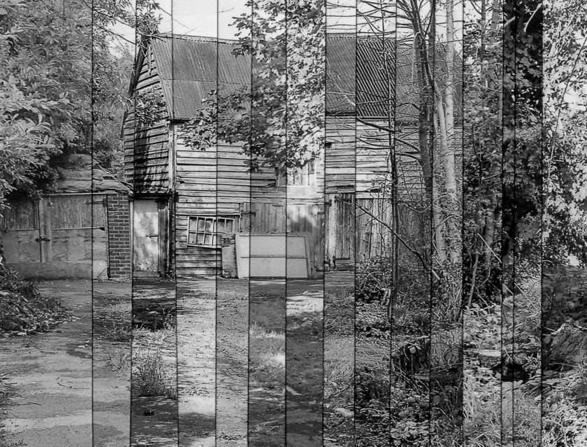
‘The selected images show a vernacular style, meaning that there is a straightforward view. There is a sense of using the frame of the view finder but this seems secondary in nature when compared to your previous work. The status of the image is rather more communicative and in one sense performative as a record of your walking. The aesthetic drivers within the compositional frame are subservient to the ‘context’ and relational aspect with the defined project that you set yourself.

I appreciate that my tutor recognised that for me, this project was about my walk and, like in Hamish Fulton’s work, the photographs were almost secondary. He also recognised that it doesn’t do a book justice to present it online but that once appropriately sequenced and compiled the meaning should become clearer.

Coursework is excellent – the reading taking place is clearlyinforming and adding depth to the coursework’ and There is lots of reflectivity and deconstruction of other work both in the visuals arts and in respect to more conceptual and critical frameworks. The reading and texts you respond to have a function beyond the visual for you, it seems that there is much in this aspect that execited you and in turn will enterinto the work at various stages’

More and more I am finding that research I have undertaken or artist’s work that has resonated with me, re-emerges later to influence my work and it is not always the things that I ‘like‘ or expect. For example, when I first viewed Hamish Fulton’s work I never dreamt he would be a source of inspiration for a future project.

For my next assignment, I have been advised to think about how I will present my work making sure that research and critical thinking is balanced with the printed materials I produce. There is a suggestion that I should discuss appropriate methods of presentation with peers. I will have 2 opportunities to do this, a landscape hangout at the beginning of January and a South West OCA group meeting 2 days later. I really value the opinions of those involved in both of these groups.

I have revised Assignment 3 since my tutor last saw my work and presented it as a slide show with the soundtrack recorded from the train journey itself. My tutor liked that and suggests this is an area I could develop further. He also suggests I could experiment further with the transitions of the sequence though this means I will have to look at something other than Lightroom for the slideshow.

My tutor finished with strengths:

  • Excellent methodology and planning of project work
  • Strong research which supports both practical and theoretical outputs
  • Learning logs has new data inc. trips and visits to exhibitions

Areas for development:

  • Editing is key, be strategic in the presentation and be aware of how much work is suited for an assessment panel
  • Have your notebooks or sketchbooks been updated, do you have prints to show and are they well printed (C-types etc.)

I totally understand the comment about editing and how much work to submit for assessment. In several of my assignments I have submitted longish shortlist rather than final images to my tutor for feedback. The reason for this has been that I was unsure of how my work would be presented and if in the form of a book, I was aware that some of my ‘final’ images might not make the cut when it came to sequencing. I have also suggested that I may submit more than 1 forms of presentation for some of my assignments, for example, a book and a poster for assignment 5. It is about discernment though so I will produce both outputs and then decide which to present for assessment.

The second point worries me more. I have not kept sketchbooks consistently and my notebooks hold a multitude of things, visits to exhibitions, workshops, SW OCA notes, etc., etc. And I’m not sure that assessors will want to see those! Where my work is presented as a slideshow (assignment 3) or a book, (assignments 1, 2, 5 and 6) – all different types of book I should add, I will also submit prints for some of the images for each assignment. Having fairly recently purchased a decent Canon photo printer, I have also sources some test packs of paper and printed samples on several papers before deciding on which best suits each project. My monitor is regularly calibrated and I am using appropriate profiles for ink, paper etc.

My tutor recommended 2 further sources of research for assignment 5:

Drowning by Numbers

1985 film written and directed by Peter Greenaway

The films key theme centers on number-counting, the rules of games and the repetitions of the plot are all devices which emphasize structure.

Chris Jordan: Running the numbers theme might connect with some of your interests.

http://www.chrisjordan.com/


Holiday Homework

With 31st January looming as the final date to get work submitted for March assessment I have gone back to the study plan I created when I first applied for assessment  and it hasn’t quite gone according to plan.  By  the  time  we  go  to  Scotland on  Wednesday,  I should  have  finished  revising   assignments 1,  2, and 3 so that after Christmas I am just left with Assignment finalising 6 and checking references and printing 4, course reflection and tidying up my blog.

In fact I have still to finalise 1, 2, 5 and 6 as well as the reflections and blog tidying.  However, I did give myself some breathing space as I left the 10 days we are in Scotland blank and although I don’t intend spending the whole holiday working I will take some prepared work with me to finish.

I have purchased the paper for my assignment 1 concertina book. Having tried different papers from a Fotospeed test pack, I  have gone for Platinum Etching, which is a nice matt fine art paper that works really well with the prison images.  I have revised the text, now in Adobe Jenson and printed all the photographs and text. I will cut the book board and paper for the cover and finish making the  book while I am away.

Assignment 5 book needs to be redone in ‘best’.  This time I am using Fotospeed Photo Smooth Pearl rather than the cheap glossy paper I used for the mock up and have printed at 5″ x 7″ rather than the 4″ x 6″ previously used. I am still using Bockingford 200 gms watercolour paper as recommended on the book making workshop for the pages and have book boards, cloth and end sheets cut to take with me.

Realistically that is as much as I’m going to get done.  I can’t finish Assignment 6 until my tutor has seen the draft and assignment 2 still needs to be finalised in my head and then printed with great care.  I have downloaded the reflection template onto my iPad and will make a start on that if I have time.

I did pretty well with my holiday homework last time we were away and I see no reason why this time should be any different.  Being realistic about what is possible is the key and sometimes it is nice just to do something normal.


Further Experiments with Assignment 6 images

Following on from last weeks experiments with the presentation of Assignment 6, I have spent the weekend trying out some more options.  Firstly, following Sarah Jane’s comment about the hard lines in the vertical strips image I wanted to try horizontal strips to see how that worked because  I felt that if I the resulting image was eye level or below, the cut edge of the strips wouldn’t have been so obvious. I think it is fair to say that they are not and that the alignment of the strips was easier than where they were vertical.  That said, I’m not sure you get the same sense of the passage of time that you do in the my first attempt so I think that once I get adjust the order of the photographs and get the alignment sorted out, the vertical image will be the better option.

Printed on metallic gloss paper

I also wanted to have another try at weaving two of the images together having printed on larger paper.  I had a couple of sheets of metallic gloss from a Fotospeed test pack which I was unlikely to use for anything else but thought the glowing winter trees might work quite well with this.  The larger print meant I was able to cut slightly wider strips and this made weaving easier.  It also allowed for some movement where the alignment wasn’t quite right which I could then trim off. I must admit, I like this and comparing it with the original attempt makes me realise how much variation there could be just by weaving different images; even more so it the photographs being woven were of different subjects.

Finally, the tunnel book mentioned in earlier posts. Again my initial experiment is based on 5 x 7 paper which means I was limited to the number of photographs I could use, in this case 6.  If and when I do this for assessment I will print  the photographs at 10 x 8 which means I should get 10 images. Following on from my recent workshop, I will also make hard covers.

In some respects, this is more forgiving than the strips because there is movement in the layers so the alignment isn’t as critical.  In previous experiments I cut oblong holes but having contacted Shona Grant to ask what she used to get her circles to neat, purchsed the tool she suggested and went for circular apertures this time.  Reflections on Shona Grant’s work here.

So where  from here?  Of the 3 options my favourites are the tunnel book and the woven image but would it be enough just to weave 2 photographs from the transitions series?  Alternatively, I could try to weave more than one together but that might be quite tricky, or again, I could weave more than one picture using different originals.

I really like the book though, maybe I could do both.

Sources:

https://www.shonagrantsart.com/artistsphoto-books [Accessed 16 December 2019]

Second experiment with Assignment 6 Presentation

Yesterday’s experiment with weaving 2 of the assignment 6 images together brought to mind the work of 2 artists that inspired me over over the last 12 months.  The first is Helen Sear, whose exhibition, ‘Prospect, Refuge, Hazard’ I saw at Hestercombe last autumn, reflection here. One of Helen’s exhibits was a huge stack of logs, entitles ‘Stack’, where she had combined 38 separate strips taken from individual photographs.

Stack : Inkjet Print on Aluminium Dibond, Santa Maria Ausilliatrice – 2015
© Helen Sear

Each strip was printed onto an aluminium panel, the metal representing the chainsaw used to cut the wood, the whole thing, which filled the wall from floor to ceiling, vibrated as you walked past.

The second is an an American  photographic artist called  J.M. Golding who works mainly with plastic, pinhole and vintage cameras for the ‘playfulness and spontaneity they promote’ (Golding, 2018).

Transitions ©JM Golding

Golding’s work, appropriately entitled ‘Transitions’ was on display as part of the ‘Out of the Woods of Thought, exhibition showing at the Argentea Gallery in Birmingham last winter, reflection here.  Rather than printing sections of several photographs separately, Golding joins together separate sections of the film to integrate the images and the result is very effective.

Golding in particular demonstrates the effect of using panels to show the differences in light and this inspired me to try this effect with my Assignment 6 work.  Like the weaving, it isn’t perfect. For this experiment I layered the photographs as far as possible in the order they were taken but I’m not sure, looking at the result that this was the best option.  I do also need to take a bit more care aligning the separate strips together. A lot of people would probably have created this work in Photoshop but apart from this really not being my forte, the photographs were taken on a film camera and I want as far as possible to create the end result manually too.

The 14 shortlisted images which were taken at monthly intervals from July 18 to September 19 were printed on 5 x 7 paper.  I cut the right hand margin off each print as a starting point then used the 1 cm marker on my trimmer to cut appropriate number of strips of each image, building up the panel as I went.  I chose this method rather than trying to align separate strips because the margin at the left of the photographs gave me something extra to align with.  The resulting panel is quite clumsy as it is 1 photograph thick at one end and 14 at the other.

strips-2
Scanned

As is obvious from the above, there are a couple of images, 6th and 7th from the right, where the alignment is not quite right.  I also need to measure the strips more accurately. Although the paper was 5 x 7, the images had been cropped to 8 x 10 (or 4 x 5) when I aligned them in Photoshop so even printing without borders, there were vertical borders at either end of the prints.  Furthermore, mixing inches and centimetres doesn’t work, so more accurate measurements next time. My other thought here is, what would this look like in black and white…

stripsbw-2

… no, I prefer it in colour.

I can see the potential though and once I have created a mock up of a tunnel book, I will submit all three options to my tutor for feedback.

14 Dec update.

Following on from Sarah Jane’s comment about the hard lines, that I hadn’t really thought about, I went back to my cut and pasted original where the lines are not so hard and certainly not black and realised that these black lines must have been caused by the scanning process. As I chose to scan for ‘print’ as I would ultimately have printed the image rather than for screen, the resulting scan was at a much higher resolution.  I would need to scan again for screen to see if that made any difference.  In the meantime I have photographed the original both from a straight on view and at a slight slant from the smoother end and here are the results: 

I hadn’t realised the difference that using a different process would make and to be honest, I’m not sure which I prefer, though maybe dark lines to white. Thank you Sarah Jane for pointing this out.

Sources:

https://www.helensear.com/ [Accessed 13 December 2019]

https://www.jmgolding.com/about [Accessed 13 December 2019]

Weaving photographs

In need of a break from assignment 6, I decided to experiment with something I saw at the ‘Blast’ festival in West Bromwich back in the summer, reflection here

A young woman called Nilupa Yasmin visits local markets and takes photographs  of the people and cultures she finds there. These photographs are then woven together and ultimately made into large hanging pieces.

This came back to mind as I mulled over different ways in which to present my Assignment 6 though needless to say my efforts are slightly more muted.

My first attempt was to use 2 of the images I had printed when I was experimenting with scanning, one zoomed in and the other not.

This was printed on some of the paper from the Permajet text pack I got a few weeks ago and was quite a heavy matt paper, too heavy to weave.  I also thought for some reason that I needed to glue the first row at the top and left side which meant that I was unable to weave right from the edge.

For my second attempt, I used 2 of the aligned images with contrasting light

This time I only glued the start of each row as I wove it though and it worked much better.

It is not perfect by any means, for a start my weaving wasn’t as neat as it should have been and I ended up having to trim the edges. I can see the potential, though probably not for assignment 6. Just a bit of fun really but isn’t that where creativity begins.


Making headway with Assignment 6

Having successfully scanned in the negatives of my Assignment 6 barn photographs my next job was to process in Lightroom before exporting to Photoshop so that I  could align the images.  My last attempt at this was limited in terms of success, here, but this time I had 15 usable photographs to play with so more room for error.  I followed Jack Delmonte’s guidance, see above link and rather than choose a final 12, or I may just use 8, images, I decided to align the whole 15 because then I could see which, if any images were too distorted to use and still have enough to choose from.

One lesson from my last attempts was that I would need to crop in quite a lot to get rid of distortion and blank document once the images had been aligned and I chose a 5 x 4 format rather than the original format as this also helped to tighten the composition.

The original 15 before alignment are…

… and this is them after alignment and cropped.

On the face of it they look ok. I will load them back into Lightroom and check them before making my final selection. After that my next task will be to print them and see where we go from there.

Assignment 6 preparation – more scanning experiments

Having posted on this topic yesterday, I have gone back to the user documentation for my scanner to see if that shed any light on my issue and from there, have experimented with different scanning modes. Initially I opted for the ‘home’ mode which according to the documentation would give  me some flexibility and also allow me to view a preview before I commit to scanning. I had opted for ‘other’ as the destination as opposed to print because this allowed me to scan at a higher resolution, because when print is selected the resolution reverts to 300 dpi.

The ‘Full Auto’ mode is just that, it decides all of the settings the resulting images have 1798 x 1108 pixels and a file size of 5.71 mb and I have to say, it does a reasonable job. 

Next I tried ‘Professional’ mode where I had to choose all of the settings for myself and went for 3200 resolution, target size  original and 24 bit colour, which according to the guidance was the setting for colour photos.  I’m not sure why, but the resulting images are all quite blue.

Finally I scanned the same negatives in again using ‘Professional’ mode but this time choosing 48 bit colour. I also ticked the boxes for unsharp mask, grain reduction and auto exposure .


As with yesterday’s experiment, I see little difference between this one and the one scanned in on the ‘Full Auto’ setting except as again, with yesterday’s experiments, I can zoom in further on the images with the higher resolution.

My next job was to print at the size I plan to use the images so that I can compare them and then scan all of the negatives in using the same settings. Before I did that, I cropped both the ‘full auto’ scan and the final ‘professional’ scan so that I could print them together to make a comparison.

Despite being a closer crop, the full auto scan was less sharp than the pro scan.  Finally, I cropped in further still.

Decision made, I will now scan all of the negatives in using the professional method.  I will get rid of the small particle of dust on the barn door before I do though!

I’m certain that the additional resolution makes little at the size I want to print these images however it I do want the best quality I can get for my assignment and scanning at the higher resolution gives me more flexibility should i wish to present my work in a different way.  It was also a good opportunity to get to know my new scanner.

Design a site like this with WordPress.com
Get started